I am blessed and cursed by an awareness of all the little frictions that get in my way when I use software.
Most ecommerce sites are covered in these. Every interaction on a product page or product listing page disables the entire page for a second while some state changes. The page will jump around, and you get the impression that every click is a potential mistake that will be difficult to walk back.
And that's even on a competently run ecommerce site – if they didn't hire someone obsessive, the trend for a storefront is for product categories and tags to devolve into an unending list with duplication and misspellings. If I'm browsing a list of shirts or jackets, and I can filter by color, the pull of entropy is for there to be multiple variations on "blue", and even if I check all of them (waiting seconds between each click for the page to reload), some genuinely blue-colored products will be incorrectly filtered out.
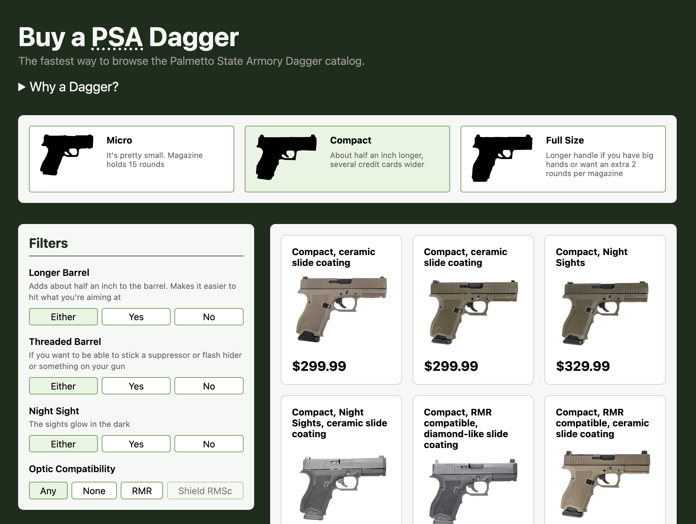
Long story short, I recently decided to make an alternate product listing page for a product line I like that is underserved by its online storefront: the Palmetto State Armory Dagger, the modern affordable cousin of the Glock. It's live now at buyadagger.com.
How to fix jankety product listing pages
Well, you still have to be obsessively vigilant about your product tags and metadata, but besides that it turns out there is actually one change that would fix the most egregious issues on every ecommerce site.
That's right, the One Weird Trick Computer Scientists Don't Want You To Know: if you have fewer than ~10,000 items, your listing pages don't actually need to query a fancy database with indexes, you can keep have the entire list in memory locally and loop over it in the dumbest possible way pulling out the items that match your filters.
Try it out on the site right now – choose a different size, or click the filters on the left. See how long it doesn't take to see the new results? You do have to wait for the images to come in, but the state of the form and the results change instantly.
Even if you're doing some kind of bespoke fulltext-ish matching like when I made my similar fan site for Shut Up & Sit Down a while back, it's still faster to loop over the array of items and use string functions than to make a request to a server to take advantage of a "real" database.
So why doesn't everyone do this?
So you, Mr. Median Ecommerce Proprietor, you definitely have fewer than 10k SKUs in your storefront. Even if you were getting close to those numbers, they would be across different categories with their own product listing pages, each of which would be well short of those numbers.
But the developers making your ecommerce platform didn't make it for you – they built it to handle the largest ecommerce site they could imagine, and they can imagine some pretty big ones, ones with SKU counts that are definitely database-index-worthy.
So what should you do? Should you hire your own developer who can build you the ecommerce solution suited to your niche? Maybe so. But almost nobody is willing to take on that kind of a responsibility when they're just getting their online store off the ground, so everyone reaches for a platform built by developers with big imaginations trying to build something that will work for any industry.
The problem with selling technical products
If you're selling anything more complicated than t-shirts, then you have an even bigger problem: a lot of the people who want to buy what you're selling can't tell the difference between your product offerings. In a lot of cases the stuff you're selling will seem like the manufacturer named it to try to actively discourage normies from figuring out what it is. Graphics cards are notorious for this, and the gun world isn't any better.
The Glock 17 got its name because it was the 17th patent that Gaston Glock acquired, and the company has honored his tradition by studiously avoiding any kind of useful meaning in their product names ever since.
The PSA Dagger is a great product and should probably be top on the list of everyone idly considering buying their first pistol without spending a ton of money, but the official product listing isn't super approachable.
The filter options on the left are a mix of things I probably care about and some that I don't, and I can't reliably tell which is which.
If you pull up an individual pistol and look at the product details, it's not much more educational. This one I just randomly opened claims as an additional feature "Stainless Steel Recoil Spring Guide Rod". Is that... common? I don't know what recoil spring guide rods are usually made out of, or how big of a deal it is to be using stainless steel. Apparently another feature is a "Flat Faced Trigger", which sounds like a schoolyard insult to me.
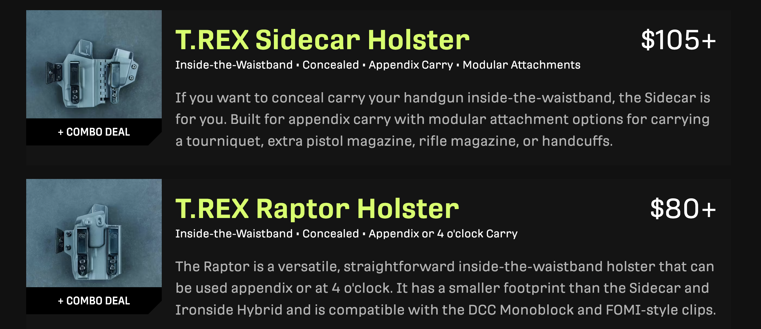
I was able to push my "this should be legible to an outsider like me" worldview a little bit when I worked at T.Rex Arms, where I pushed to change their holster listings page from being a grid of images and product names to having bullet points listing the differentiating features plus a short approachable paragraph.
For my Dagger project, this meant scraping all the Dagger product listings, parsing them, feeding them to Claude and spending about an hour asking it a bunch of questions to figure out what all the options and random letters in the product names meant.
Then came the editorial aspect – which options are likely to matter to a non-gun-nerd buyer, and how do I present them? I don't want to explain what "X-1" means, but if some pistols have longer slides than others, that's a meaningful difference I'd want to know about.
What is "design"
You could tip over any freshman art class and get a pile of designers with a better sense of aesthetics than me. I've chosen to focus on the parts of software design that let people do their jobs easily.
On buyadagger.com, every filter option operates like a radio button, but it is also a link. You can middle-click on any one and it will open correctly in a new tab. They are all keyboard accessible.
The product listing names are generated dynamically with the differentiating features that I think matter most, but if you filter to e.g. only view pistols with night sights, I don't display "Night Sights" in the product name, because what would be the point of that extra text next to every item in the list.
And above all, the list updates instantly with every click.
This is the kind of design I care about, and it seems rare. It's easier to build software that looks aesthetically pleasing in Figma than it is something well built for purpose.
This post is part of a series on how I think about software.
If this resonated with you, you should reach out to me to let me know, maybe we can work together some day.
Eschatology of software • Communication culture • The joy of inventory software • On making a product listing page that doesn't suck